v e r o m a

Toma Parte

Branding & Illustration

Designing is about opening doors to conversations that matter.

Arquitectura Sin Fronteras came to us with a clear vision: create the brand for Toma Parte, their global justice education program. They wanted to talk about habitat—but not about houses. About that place where we live that goes far beyond four walls: the neighborhood, the street, what we share, what we lack.

We set out to build an identity that didn’t sound institutional or preachy. Something that breathes, that invites you in, that makes you ask questions. Who decides what your neighborhood looks like? What does it take to live well? What would a fairer place look like?

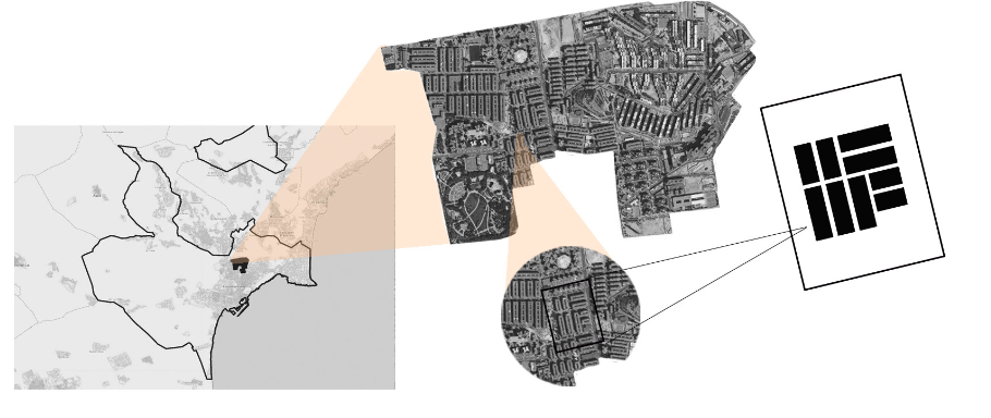
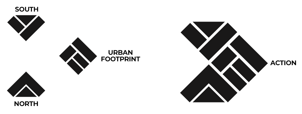
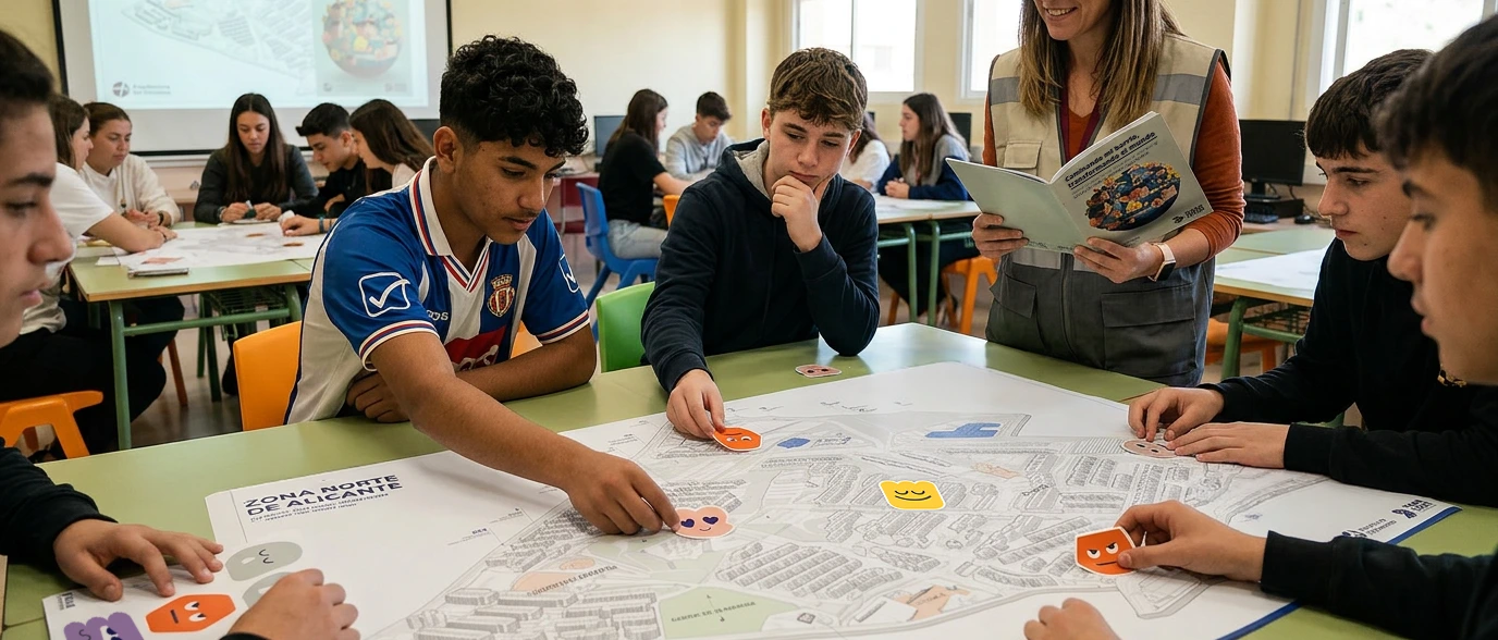
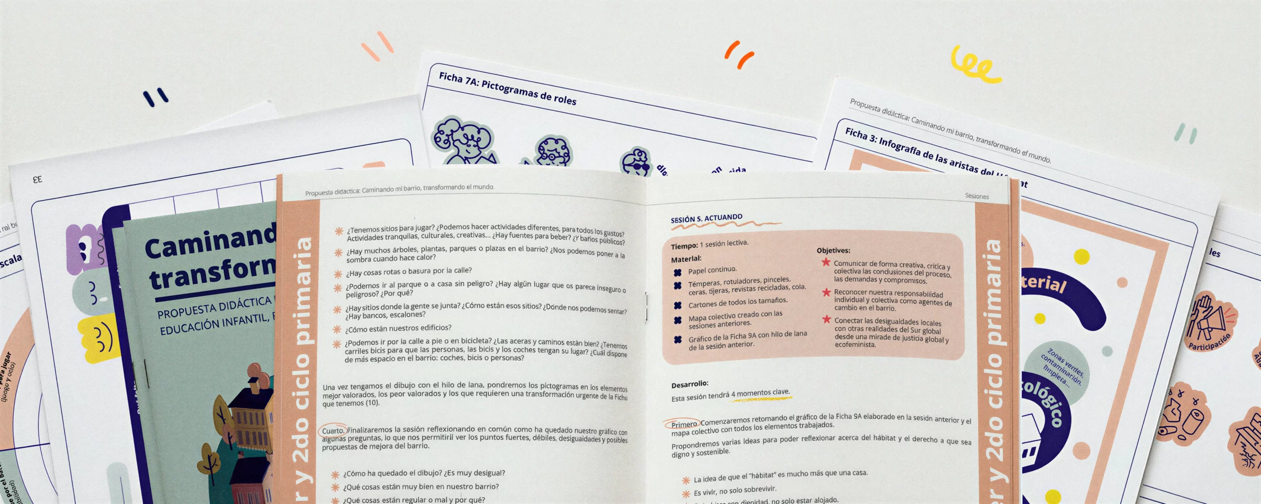
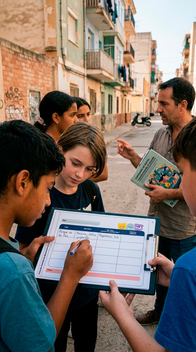
Beyond the brand, we designed a complete educational unit: illustrations, worksheets, cover. Material to bring into schools and work on territory through social cartography—looking at the commons with fresh eyes.

And to tie it all together, a landing page where the whole project lives and the materials can be downloaded.

The result is a living brand, built so that big ideas can reach people of all ages. An identity that speaks of care, community, and the future—without lecturing.

URBAN FOOTPRINT

The inspiration comes from the “urban footprint”: the trace of how we live and build our neighborhoods. That footprint, which reflects inequalities, can also be transformed when we get involved. From this perspective, the project connects the north of Alicante with villages in the south of Guatemala through participation and solidarity.

NORTH AND SOUTH

The logo reinforces this idea. With a direct, no-frills typeface, it works like a rallying cry: “Toma Parte” (Take Part). The symbol reinterprets a compass: it places the North at the base—as a structure that propels—and the South at the top—as a horizon that gives meaning—expressing the values that drive us: social justice, ecofeminism, and human rights. Together, the brand is modular, adaptable, and designed to accompany processes that transform reality through small collective acts.

“We wanted a brand that made it easy to approach a complex topic without losing depth or sensitivity. Veroma knew how to shape Toma Parte with an approachable, visual identity that’s deeply aligned with the spirit of the project.”